
Before starting to create a corporate identity manual, it is essential to understand what a brand identity really involves. Many people think it is only about a logo, colors, and typography, but the reality is much broader. Here, we explain what it consists of and what elements a good corporate identity manual should include.
What is a corporate identity manual and what is it used for?
A corporate identity manual is a guide that establishes rules to maintain the visual and verbal consistency of a brand, ensuring that it is always recognizable and coherent. In short, it is a document that defines how the brand communicates across all channels and with all of its audiences.
A corporate identity manual can also be referred to as a brand style guide.
Beyond an attractive logo or elegant typography, brand identity defines how the brand communicates with its audience, preventing its visual and verbal expression from becoming disorganized or inconsistent. In this way, it creates a distinctive image that allows the public to recognize it even without seeing its name.
Here are some examples:
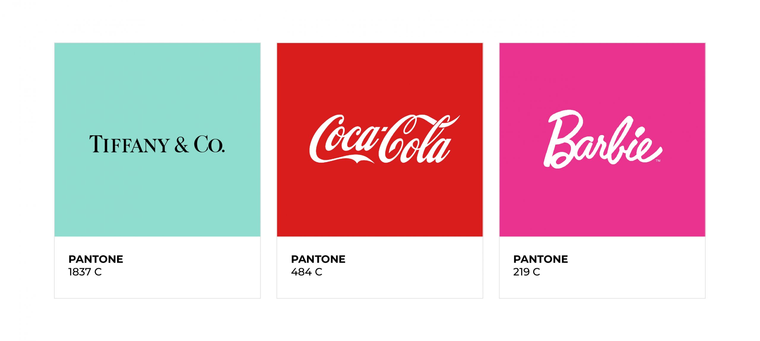
Look at these corporate colors. Would you associate them with any brand? You’re probably thinking of one right away…
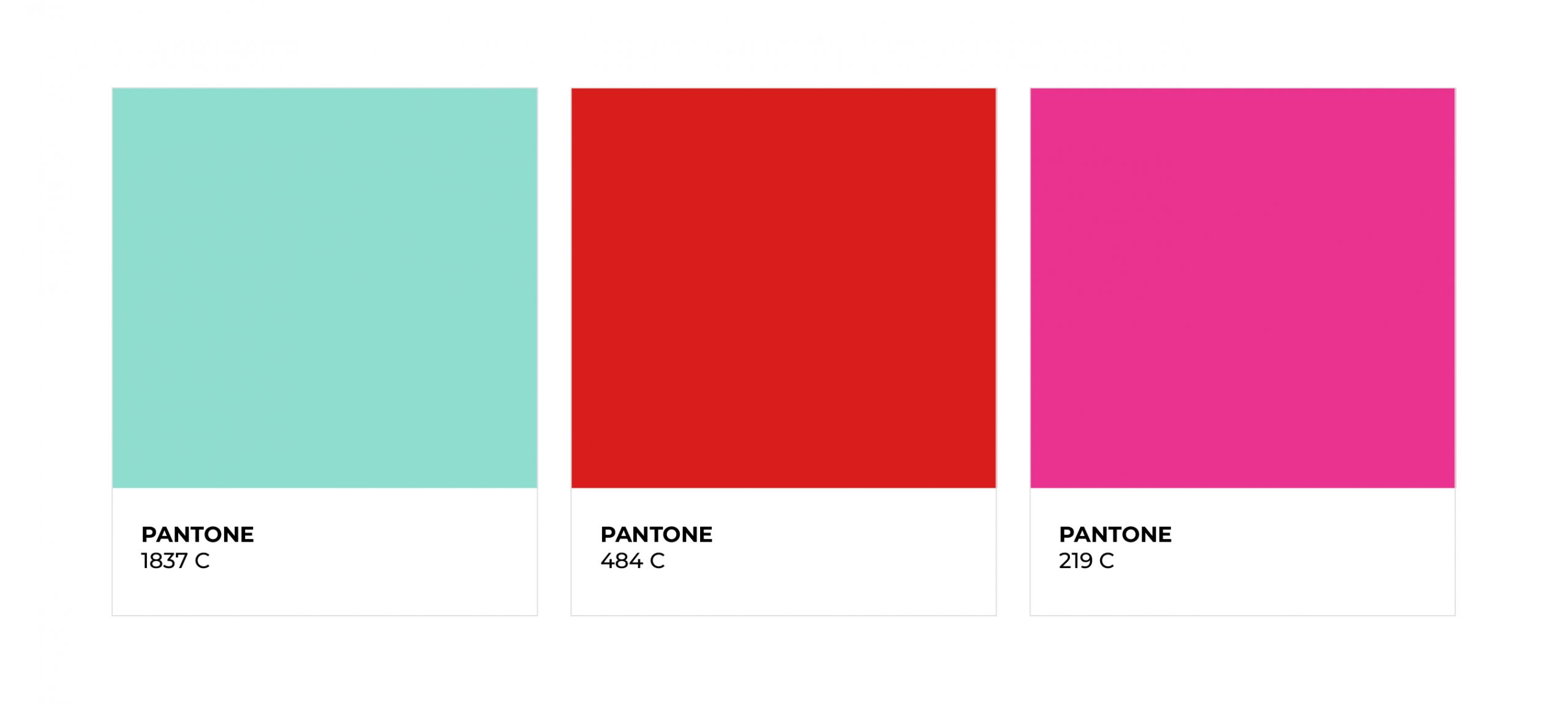
Result: in addition to colors, companies are associated with certain values or a specific identity. For example, the well-known fashion brand Ecoalf immediately brings sustainability to mind; while IKEA evokes a familiar and cozy feeling (as well as positioning itself as an affordable brand); and Coca-Cola is linked to moments of happiness and entertainment shared with loved ones.
These are just a few examples of brands that have spent years carefully developing their brand identity in order to achieve a consistent and recognizable positioning.
Are you able to recognize the identity of the most well-known brands? Check this video.
What are the steps to follow to create a corporate identity manual?
Now that we are clear on what a brand identity manual is, let’s define all the elements that should be included to make it complete and professional
1. Brand objective and mission
The first step is to define the brand’s main objective, its mission and purpose. For example, Google’s mission statement is: “to organize the world’s information and make it universally accessible and useful.”
At this stage, a slogan or claim can be created—a short phrase capable of capturing the essence of the brand without the need to show the logo. Who doesn’t recognize Nike’s iconic “Just do it” or McDonald’s “I’m Lovin’ It”? These are phrases that summarize the identity and remain in the audience’s memory.
2. Logotype, Isotype, or Imagotype
Habitually, the term “logo” is used to refer to any graphical element of a brand, but it is important to distinguish between:
- Logotype: only the brand name in text format.
- Isotype: a symbol or icon that identifies the brand without text.
- Imagotype / Isologotype: a combination of logotype and isotype. An imagotype allows the elements to be separated, while an isologotype merges them into a single design.
The logo represents the visible face of the brand and should be simple, recognizable, and consistent with its values. Some guidelines to follow include:
- It should be designed using a grid system, always maintaining the same proportions.
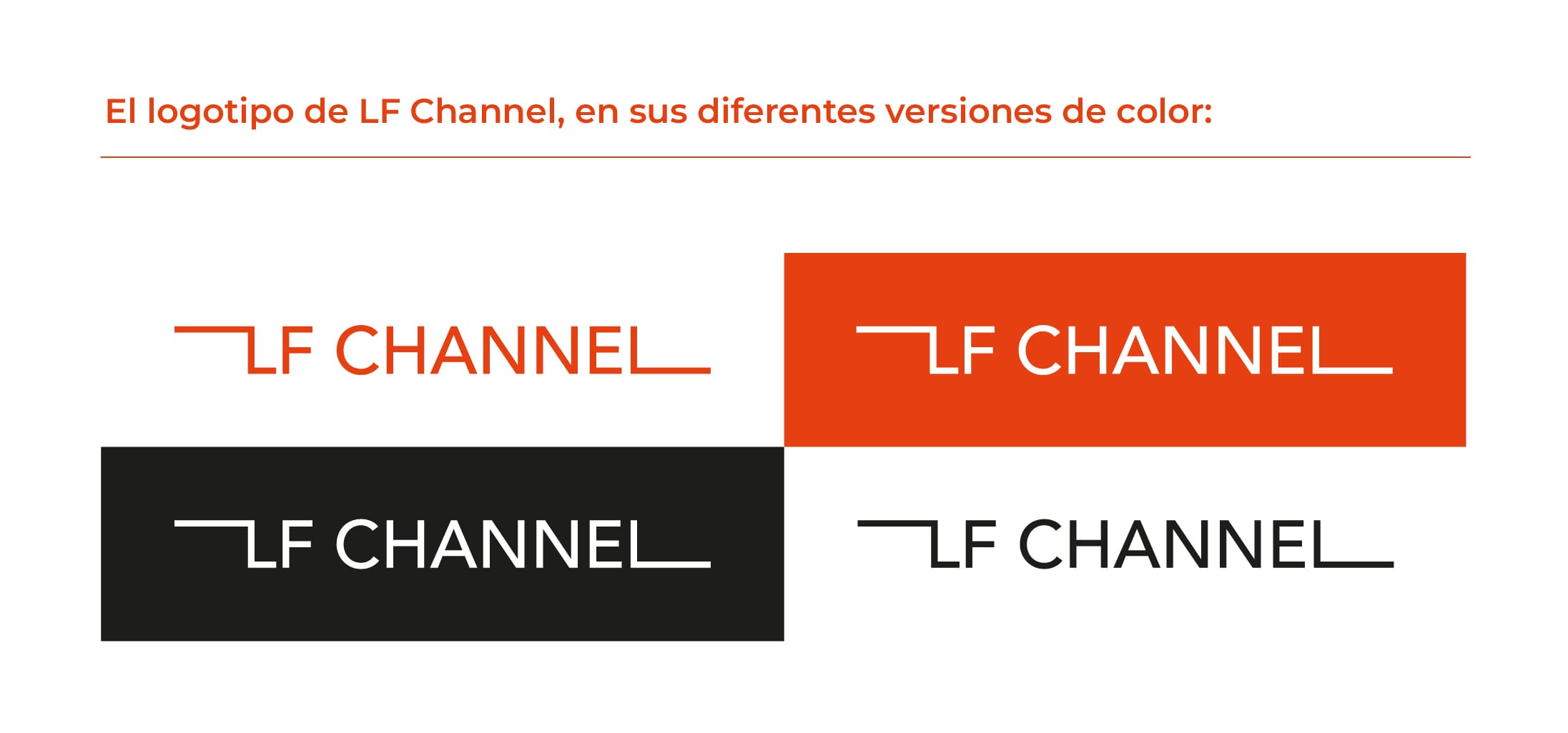
- It must be usable in both positive version—how the logo appears on a white or light background—and negative version—white logo on a black or dark background.
- It should be adaptable to any medium and format without losing readability or sharpness: from printed brochures to web banners.
- It should include “do’s and don’ts” guidelines, indicating how the brand identity should be applied. For example:
Do’s (how to correctly use the logo)
- Use the white logo on dark backgrounds or the black logo on light backgrounds.
- Always maintain the proportions and spacing defined in the grid.
Don’ts (how not to use the logo)
- Do not stretch or compress the logo, altering its proportions.
- Do not place it on a background that makes it difficult to read, such as a busy texture.
3. Corporate colors
Corporate colors identify and differentiate the brand. Some companies even register their own color, such as Coca-Cola or Tiffany & Co., to make it exclusive. Colors are capable of conveying emotions and values; the chosen colors should have good readability and be accessible to people with visual impairments. For this purpose, WCAG contrast tools can be used to ensure that text remains visible on any background.
It is important to consider the different color codes:
- Digital: in this context, colors are represented using codes that screens can interpret, since screens use light to display colors:
- RGB, which combines red, green, and blue to create the colors we see on screen.
- Hexadecimal, a six-digit code used in web development.
- Print: when working with materials that need to be printed, colors are created by combining CMYK (cyan, magenta, yellow, and black), since these are the inks used by printers.
Maintaining consistent colors helps strengthen brand recognition and reinforces its visual presence.
4. Typography
Choosing typography is crucial for visual consistency. The main typeface and any secondary typefaces must be specified, including their name, different weights, and paragraph styles depending on how they are used across different types of text.
Typography should reflect the brand’s personality: for example, a tech brand typically uses a modern sans serif typeface, while a luxury brand opts for a more classic serif style.
The difference between these two categories is:
- Serif: typefaces with small strokes or decorative elements at the ends of letters, conveying a classic and elegant
- Sans serif: typefaces without strokes, with simple and clean lines that communicate a modern and contemporary image, ideal for technological or up-to-date brands.
5. Voice and tone guide
Every brand has its own voice, just like people do. We don’t use the same tone in a business meeting as we do in a family conversation, and the same applies to brands.
The voice and tone guide defines whether the brand will be approachable, professional, friendly, formal, etc., and how it adapts its tone depending on the channel or situation.
To structure this guide, it is recommended to define a Core Strategy Statement, which is a brief statement that acts as the backbone of the brand strategy and defines:
- Who the target audience is
- What need the product or service offered by the company addresses
- How the brand meets this need
- What the brand’s key differentiating value is
6. Iconography style
Icons accompany visual content and help communicate information quickly. To maintain consistency:
- Define whether icons will be filled or outlined.
- Establish line thickness, spacing, and corner style.
- Maintain a harmonious color palette.
Having an icon library helps save time and ensures visual consistency.
A notable example of consistency in brand visual language is Apple, whose iconography maintains uniformity and clarity across all its products and platforms.
7. Illustration/photographic style

If the brand uses illustrations as part of its identity and brand storytelling, they must maintain visual consistency. The same applies to photography: the way images are shot and produced is directly related to the brand and must be clearly defined in the company’s corporate identity manual.
At LF Channel, we maintain a consistent photographic style in our social media content, using black-and-white images that highlight the brand’s primary color: orange.
Why does your brand need a corporate identity manual?
A corporate identity manual ensures a consistent image and aligns the entire team with the brand standards. Its main benefits are:
- Consistency across all communications: Today, brands interact with their audiences through multiple channels. A manual defines how the brand should communicate in each medium, ensuring that the message remains coherent in any context.
- Communicating your brand values: Every visual and verbal element communicates something. A color can evoke emotions, and the tone of communication conveys the brand’s personality. In an increasingly digital world, closeness, humanity, and authenticity are values that users look for and remember.
- Differentiation from the competition: A recognizable brand needs a consistent and distinctive voice. The manual ensures that both communication and visual identity reflect the company’s unique personality, helping it stand out in a saturated market.
Would you like to see how we work on brand identity for LF Channel and other companies? Take a look at some of our graphic projects on our Pinterest page.
Corporate identity manual examples
The power of a brand is first perceived through the eyes. To understand how brands apply their identity consistently, below are some examples of corporate identity manuals from well-known companies:
IBM corporate identity manual

https://www.ibm.com/design/language/
The IBM manual is an example of how a global brand maintains consistency across all its products, platforms, and communications. It includes guidelines on typography, color, iconography, layout, and motion design, as well as user experience principles, making its visual identity clear on a global scale
Spotify corporate identity manual

https://developer.spotify.com/documentation/design
Spotify’s manual provides detailed guidelines on how to apply its visual identity consistently across digital products and marketing materials. It includes rules for logo usage, color palette, typography, iconography, and interface components.
If you want to take your brand to the next level and have professional support in developing your identity manual, at LF Channel we can help you define, design, and apply your identity in a strategic and consistent way. Get in touch with us and we’ll help you!